Case Study
Cash Back rewards without all the effort
Client
Credit Karma
Role
Design Lead
Contribution
Content Strategy, Design System, IA, UX
Brought Credit Karma's Cash Back program back to life and gave millions of customers a free, effortless way to earn money back on everyday purchases.
Continue reading
(7 minutes)
Credit karma provides insights, resources, and assistance for your finances
The Product
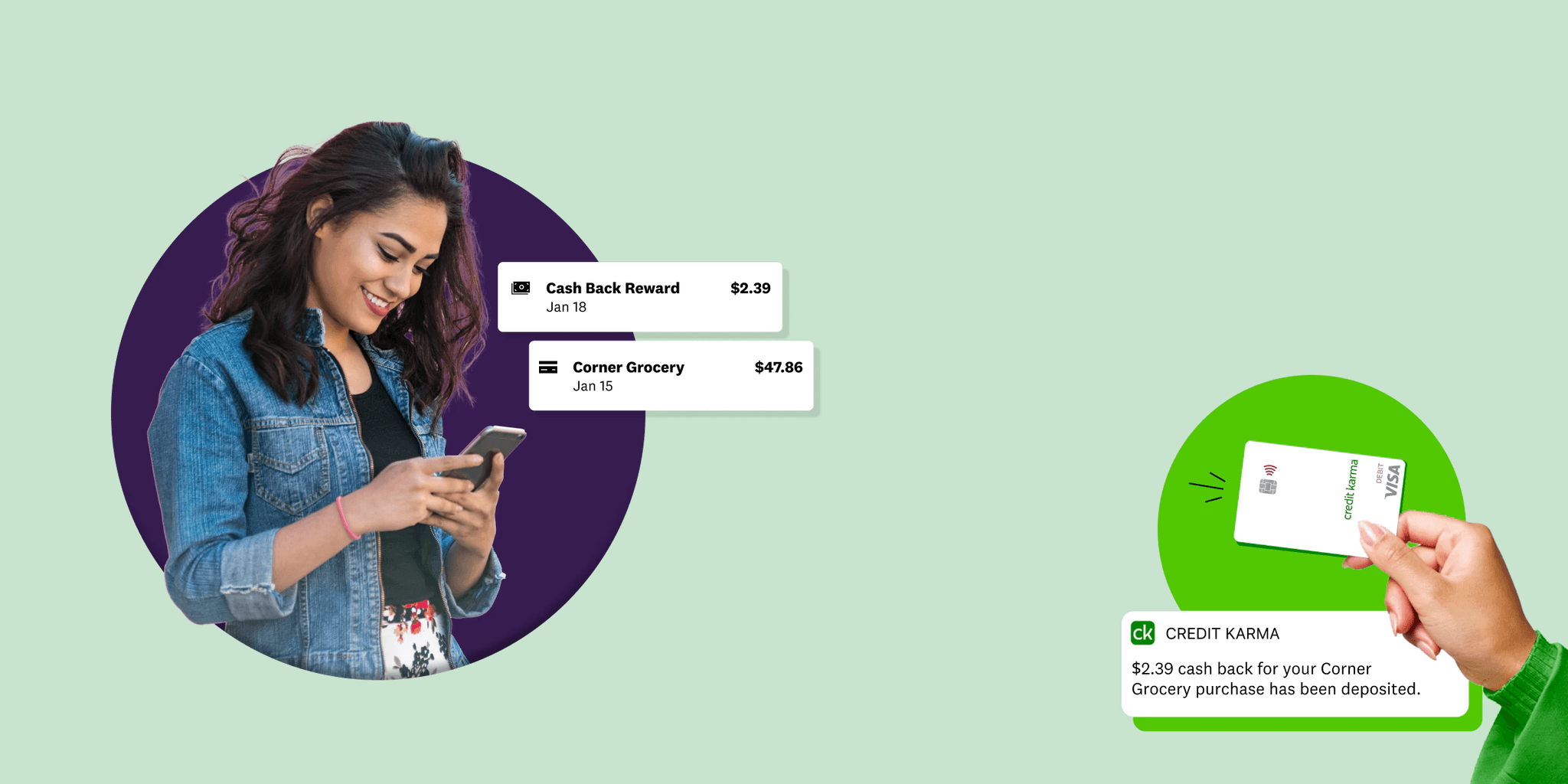
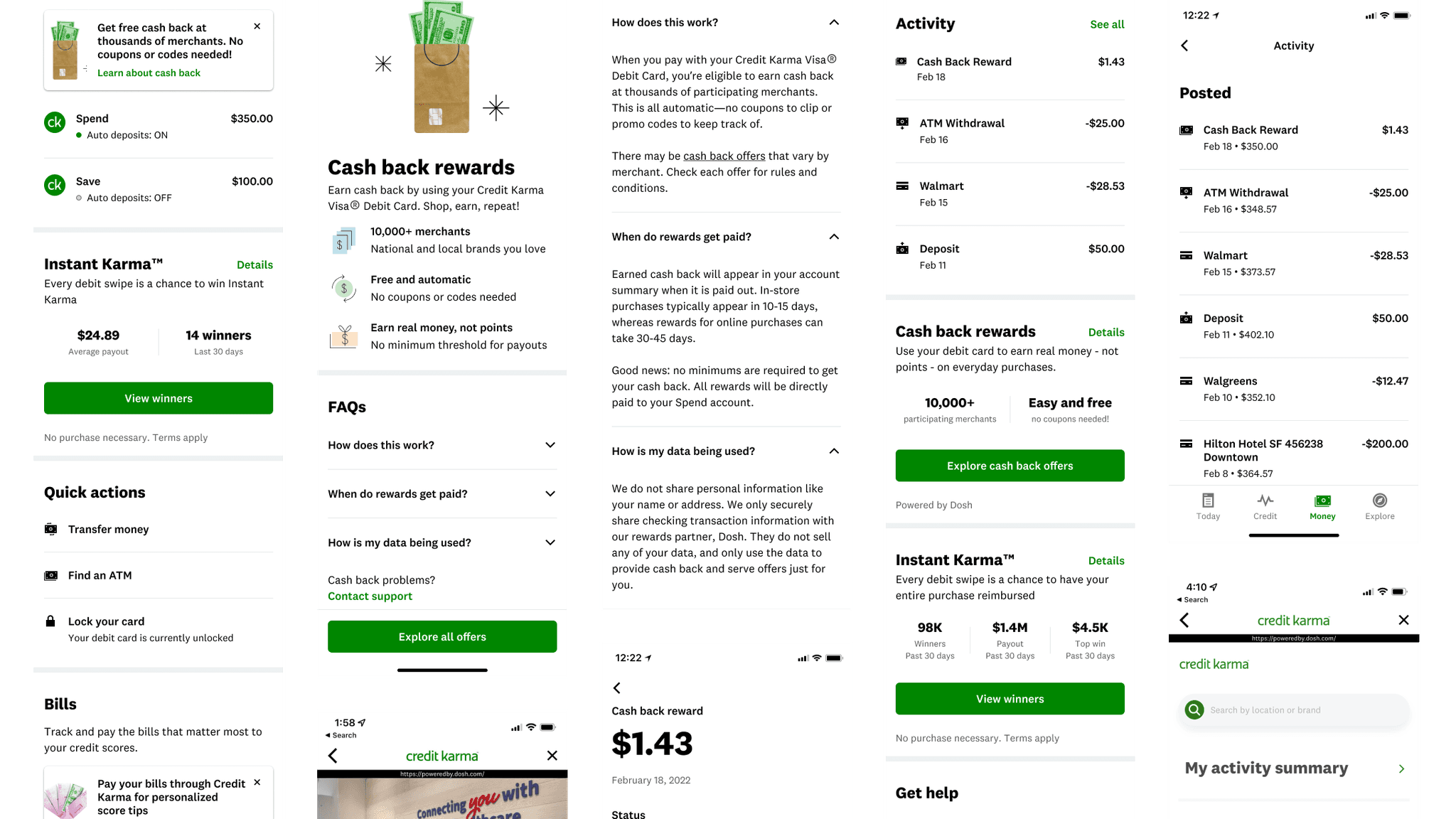
Free, Automatic cash back just by swiping your Credit Karma debit card
Credit Karma, an establish brand with over 100 million customers, had begun work on a Cash Back program that fit within their Money offering of both online checking and savings accounts. When that work stalled, I was asked to lead a small team to bring it over the finish line.
Cash back rewards were granted for using the Credit Karma debit card provided to Money customers anywhere they shopped, with special promotions and deals offered through partnerships with the service behind the scenes, Dosh. This program's biggest advantage was that debit card holders didn't have to use coupons, add deals to their account, or request rewards. Everything happened automatically, and they could easily search for new deals right from their phone.
The Problem
Can we provide a seamless experience for Cash Back across our own product as well as our partner's?
While some Cash Back features had been planned out for the Credit Karma mobile app, the launch was paused as Product and Engineering dealt with some roadblocks. When the work resumed, I joined a group within the Money team that was tasked with completing the work and collaborating directly with the Marketing and Engineering teams on an official launch to millions of customers with Spend accounts.
Finding the missing pieces
The existing design work was helpful, but moving forward our team made sure to avoid assumptions on what we should build based on what the previous team had come up with. What was working, what wasn't, and what was missing? Those were the questions we constantly asked ourselves throughout the design process.
Aligning with with the Dosh platform
To bring merchant-funded cash back offers to Spend account holders, Credit Karma integrated the Dosh platform to handle transactions, offers, and more. Our design team worked with their design team directly, which included sharing insights on both design systems.
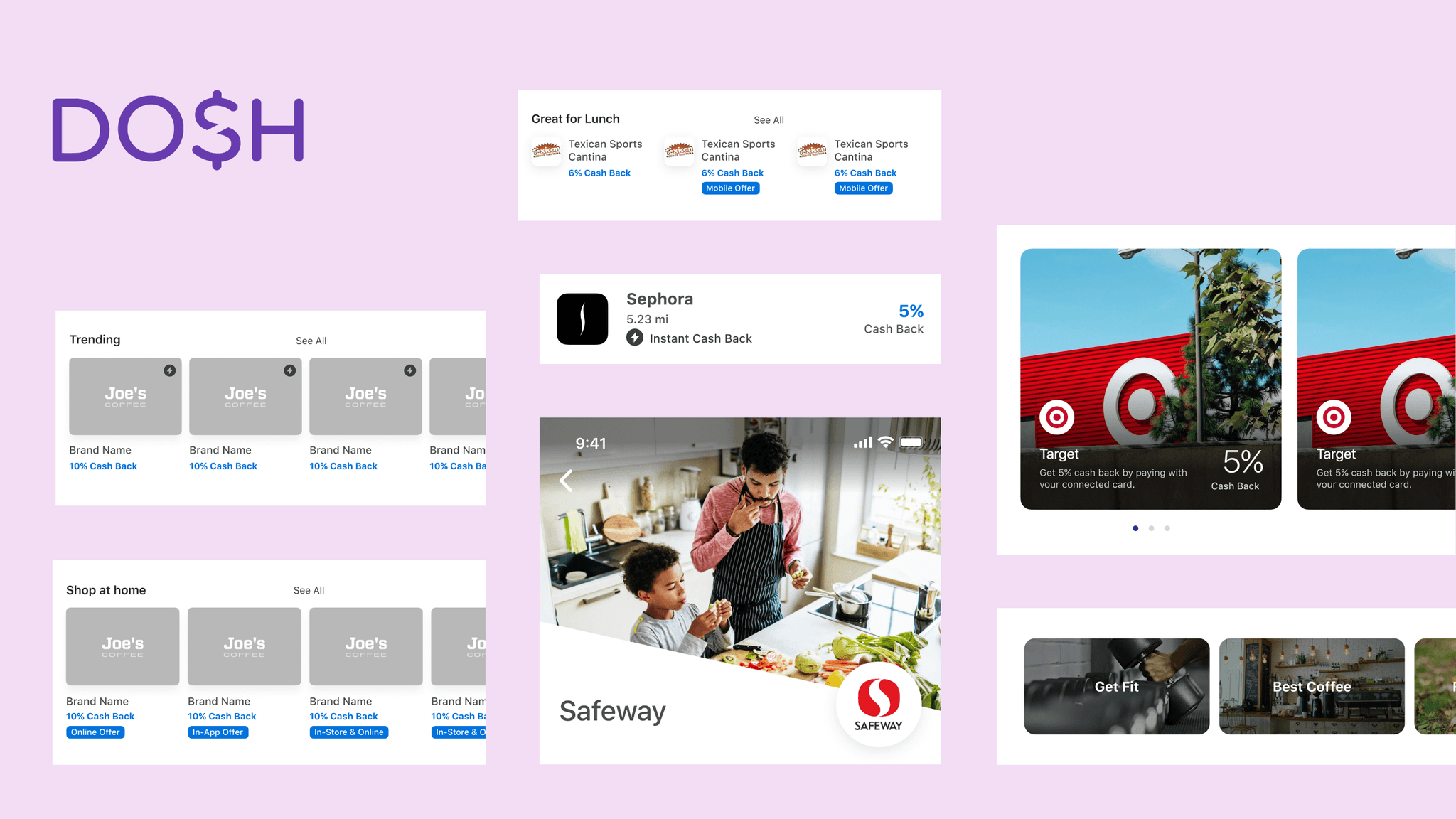
Our team took style and layout recommendations from the Dosh design system
Spreading the word about Cash Back
Our goal was to drive continued use and engagement with our checking/savings accounts by offering cash back features that customers actually wanted. To do this, we needed to not only provide automatic rewards, but also let all Credit Karma customers know about this new program by working with other teams within the organization to direct customers to Cash Back promo information.
Research
Making sense of the previous Chaos
There were some gems (and some duds) in the previous design work for Cash Back, and I wanted to be sure to review everything, including notes left by the previous team that worked on it. Their research and design explorations helped jumpstart our process and gave us insight into what might work going forward.
Streamline and inform
At the onset of this project, I inherited a chaotic design file with many explorations and an experience that hadn't nailed down its design language. As such, the existing user flow didn't match with the structure and efficiency of our design system and wasn't properly communicating the value of Cash Back within the Credit Karma ecosystem.


Design Explorations
Putting the design system to work
While the Credit Karma design system allowed me to focus on the overall experience and customer needs, that didn't mean I wasn't sweating the details in many cases. Whether it was finding the right components, or suggesting new ones, I was always looking for the best way to connect with our current and potential users.
Stay in your (swim)lane
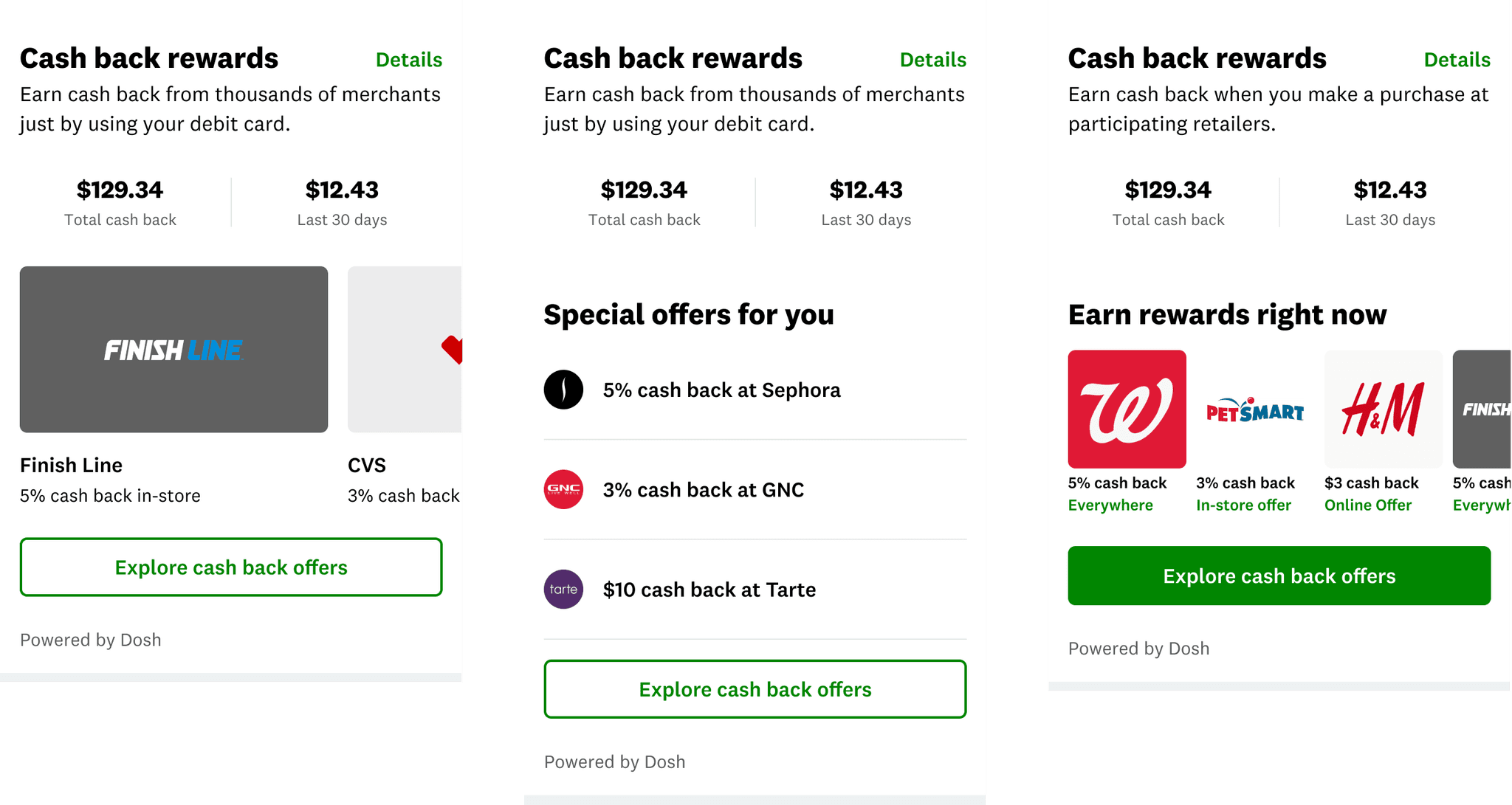
Highlighting personalized or trending merchant rewards was high my list of challenges, and while the design system was fairly robust, I struggled to find the right component for the job. Part of this challenge was trying to bridge the gap between Credit Karma's native styling and that of Dosh's web portal, which also highlighted these rewards. In the end, I proposed a new variant to the Router component's Swimlane layout to the KPL design system team, which was eventually approved and available to other parts of the Credit Karma application.


Pivot Point
When "pending" means 24 hours or 24 days
As always, informed assumptions had to be made from the beginning of this project, one of which was how long a customer's pending cash back would take to hit their accounts. Initially our team was told by our partners at Dosh that this likely meant 1-7 days, which didn't seem like a problem to immediately solve for considering our other priorities. That soon changed.
The cash came back the very next day… sometimes
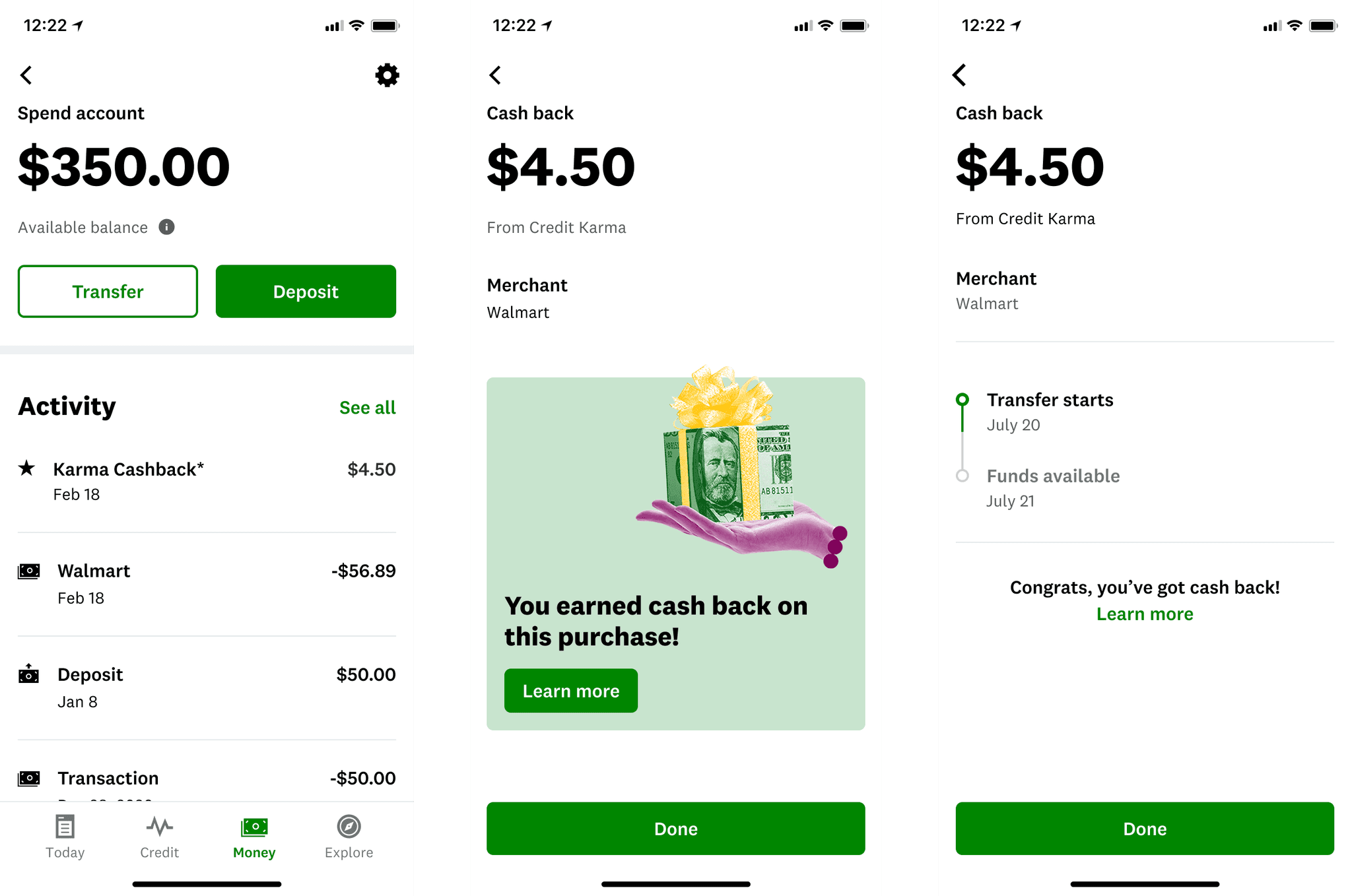
Depending on the merchant, cash back rewards could hit customer accounts in 24 hours, or up to 45 days. Unfortunately this was a reality we weren't prepared for up to that point, so my priority went to finding a solution to best inform our customers about pending transactions, which included a redesign of our Cash Back activity log.
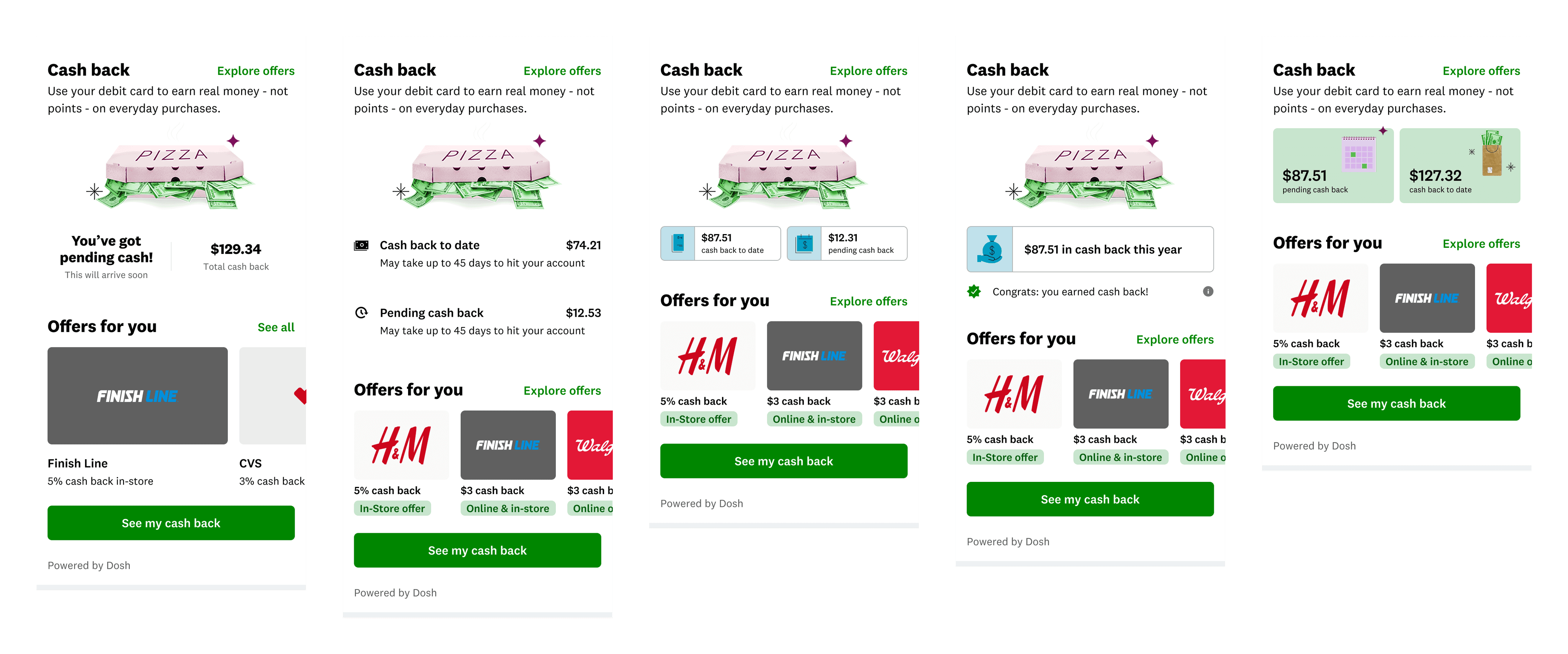
Several iterations of informing customers of pending cash back
Design Reviews
Everyone had a voice during our silent crit
As a design team, our goal was to collaborate even when we were working on separate parts of the Credit Karma app. Weekly design critiques were meant to provide insight into our work, garner feedback from colleagues, and generally understand where the app's design direction was headed.
Our weekly critique sessions were open to all designers from any of the app teams, which built up trust and collaboration across the different pillars we were working in. Overall our sessions were professional yet relaxed, striving to be productive while also giving us a virtual water cooler break.
In order to ensure that everyone had a chance to share their feedback, we employed a Silent Crit each session that kept our calls short while providing the most insight at the same time. One designer would shared context and explorations, everyone took 10 minutes to add sticky notes to the Figma file, and then 10 minutes were left to discuss further. Even when we couldn't get to everyone's notes, they were preserved in the critique file to be reviewed or discussed later.
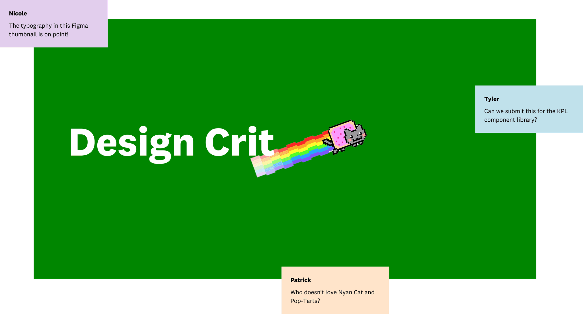
Weekly Design Critiques were professional but fun
Outcome
A little bit of cash back goes a long way
Putting money back in people's pockets doesn't come with much of a downside, but the bigger win when launching Credit Karma's Cash Back program was the positive impact it had on the entire company as well as our partnership with Dosh.
With an estimated 4% of Credit Karma's customers using Money accounts, the newly added Cash Back program gave them even more of a reason to use their checking and savings accounts. The Marketing team was also excited to have a flagship feature to tout in app, web, and TV campaigns to get the attention of potential customers.
By working together to launch our Cash Back program using Dosh's technology, both teams were able to align on technical constraints, customer needs, and platform integration. Planning for future API implementation for native features in the Credit Karma would require everyone to be on the same page going forward.
Retrospective
strong communication and a solid foundation makes a big difference
Two very well organized teams in two very different organizations were able to consolidate their efforts and deliver a huge value add with a well-crafted experience in just a few short months, and in the process learn and pivot quickly when we needed to.
Customers didn't want to work for cash back
Something that set our program from other cash back offerings was the effortlessness of earning cash back, a customer request shown through research from other groups within the company. Our job as designers was to communicate the ease of use that Dosh's platform provided us, and our customers.
Design systems have a breaking point
Credit Karma's design system was robust, well documented, and made it easy for designers to focus on the UX rather than individual UI details. That said, the system didn't account for everything, and I ran into a roadblock when none of the existing components fit my needs.
Design systems as products need to grow organically with the needs of the organizations they serve.
Dan Mall, What is a Design System
Great partnerships start with communication
Our ability to restart this project and bring it to launch as quickly as we did was only due to the incredible relationship between the people at both Credit Karma and Dosh. Whenever we ran into an obstacle with implementation, either engineering or design, our teams were able to find a solution together. And without documentation and well-organized design systems on both sides, it may have taken twice as long to get to market.
Credit Karma's Cash Back program allows customers to shop, earn, and repeat
TLDR;
Shipped an effortless Cash Back program to millions of Credit Karma customers in just 4 months
As design lead for Credit Karma's Cash Back offering, I was able to:
Inject life into an abandoned project, take it to the next level by sweating the details, and bring it over the finish line
Integrate a separate platform into the mobile app by aligning two different design languages into one seamless experience
Collaborate with the Cash Back team, other app designers, the Design System team, and even folks outside of our organization to align on customer needs
Pivot the user experience to address issues out of our control and inform customers of delays in pending cash back activity in a transparent and friendly manner
Launch a low overhead cash back program to millions of customers already using their debit cards for everyday purchases