Case Study
Painless Access and payments Wrapped around your finger
Client
Token
Role
Product Design Lead
Contribution
App Design, Content Strategy, Design System, IA, UI, Usasbility Testing, UX
Introduced an innovative new product to the world by crafting an intuitive, trustworthy experience around a smart ring that provides access to all of your credentials.
Continue reading
(9 minutes)
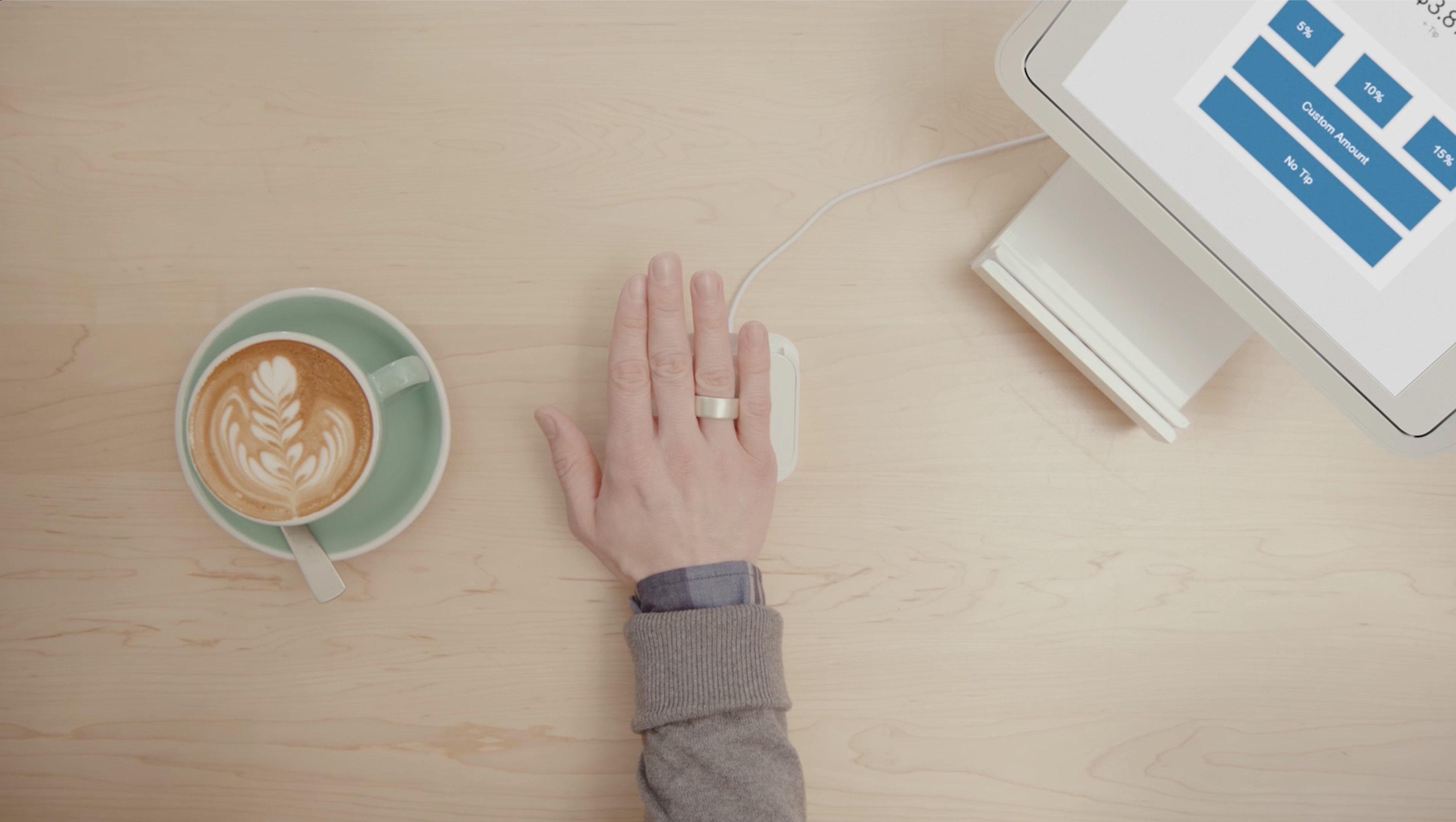
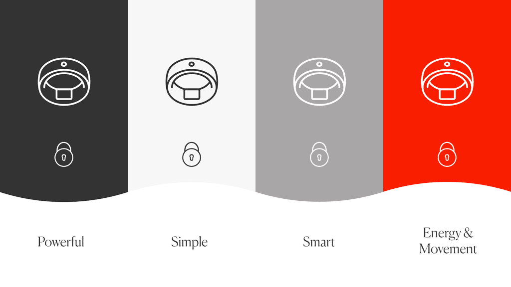
Token is a biometrically-secured smart ring that stores your credentials and can only be used by you
The Product
Token Provides effortless access and ultimate security in the form of a beautiful ring
A smart ring for payments, building access, and much more, Token is uniquely secure because it only works when worn by its owner thanks to built-in fingerprint and proximity sensors. Scan your print, slide the ring on your finger, and it's ready to use. Take it off and it automatically deactivates itself so that no one can access the credentials stored on it's secure enclave chip.
Token's mission is to deliver people a unified way to identify themselves to the world. All your keys, cards, badges, and passwords are stored on a beautiful ring you'll want to wear every day. Token offers a single way to prove your identity for effortless and secure access to your entire world.
The Problem
Can we turn user friction into everyday habit?
Physical products are difficult to design for even when they are familiar to users, have some sort of display, and don't contain bank-grade security. Token accomplished no small feat by bringing an entirely new product to market in a form factor small enough to fit on a finger. However, the unconventional nature of using Token required an entirely new mindset from our customers, and it was up to us to help them.
People who are really serious about software should make their own hardware.
Alan Kay
Turning engineered complexity into designed clarity
When development drives design, usability often takes a back seat to functionality, resulting in confusing navigation, inconsistent design patterns, and workflows that don't align with real user needs. When I joined Token as design lead, I inherited an app that technically worked but lacked clarity, polish, and a seamless onboarding experience.
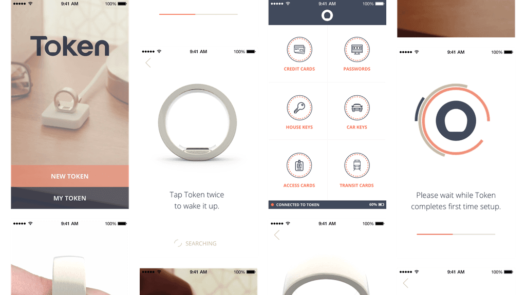
The early companion app was confusing, unpolished, and off-brand
Making the future feel familiar
Onboarding customers is more than just guiding them through setup, it's about building trust in a completely new way to interact with the world. Unlike traditional devices, Token requires users to authenticate with their fingerprint, slide their ring on after authenticating, and learn new gestures to put it to use. The challenge is making this process feel intuitive, effortless, and fail-proof while ensuring security remains uncompromised.
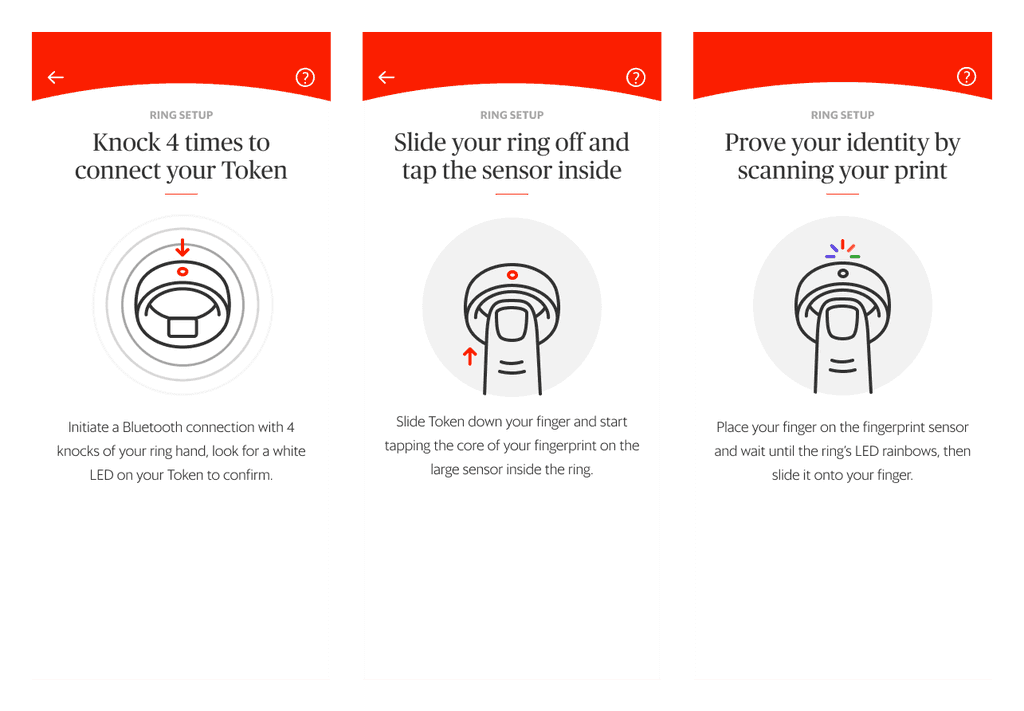
A few of the instructions needed to setup and use the ring
On your finger and ready to go
Another usability challenge with Token was ensuring customers understood that the ring must be worn and authenticated to function. Early on, I noticed friction when users attempted to make payments or unlock doors without first activating the ring with their fingerprint. We didn't need to just to fix a problem, we had to make Token's behavior feel natural and intuitive, reducing user frustration and reinforcing trust in the product.
Research
Borrowing Brilliance from Drones & other Wearables
Improving Token's user experience started with deep research into how users interpret feedback from wearable devices and those without screens. Without a competitive analysis, I looked to similar products (USB security keys, smart fitness wearables, and NFC cards) for both inspiration and guidance on best practices.
No screen? No problem.
As the ring has no screen, LED patterns became a crucial communication tool for customers. I explored best practices from adjacent industries, finding that drones use LED cues for status updates in normal flight and emergencies. Studying user manuals and product videos provided a lot of insight into how colors and patterns could be used to enhance Token's experience.
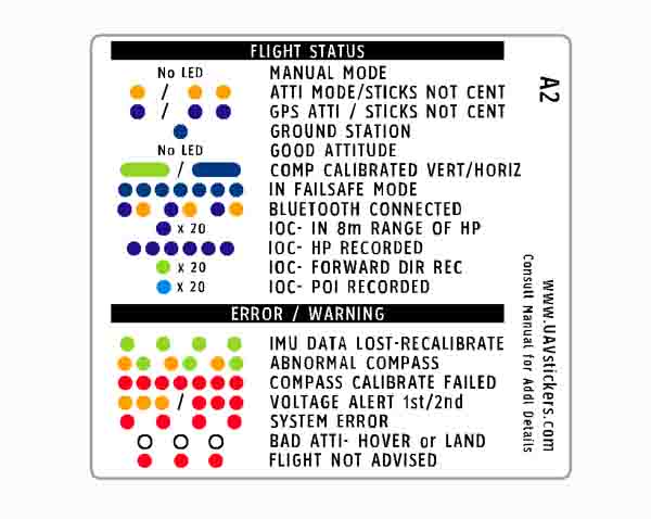
The DJI Phantom drone uses LED blink codes to signal status and errors
Going ring shopping
While not offering the same features at Token, I found it interesting how the Oura ring provides passive feedback without disrupting the user experience of providing data on fitness and sleep, among other things. This research confirmed once again that our product had to be both simple and natural to use on an everyday basis.
Design Explorations
Designing the Token app for Clarity, Confidence, and Control
During design explorations, I quickly discovered that Token's app experience required a delicate balance of brand identity, usability, and security. Through thoughtful iteration, strategic design decisions, and a constant feedback loop with early adopters and other team members, Token's app became more than just a companion. My goal was to create an extension of the ring itself, making identity effortless, secure, and intuitive.
Avoiding red flags and grey areas
Incorporating Token's brand colors into the mobile app was a balancing act between visual identity and usability. While the bold red conveyed energy and strength, it also risked feeling overly aggressive and urgent. My goal was to harmonize these colors in a way that felt intentional, which required both design iteration and the convincing of our CEO. The result was a visually striking yet highly usable interface that reinforced Token's brand without compromising functionality.
Mapping Token's Brand Guidelines to a mobile app style guide
Transforming setup into second nature
Crafting Token's onboarding process was all about turning a series of technical steps into an intuitive experience. Structuring the flow into clear, guided interactions allowed the process to feel both effortless and secure. Through thoughtful animations, inline guidance, and real-time feedback I managed to take things a step further by building habits right from the start. Onboarding signaled to customers what to expect from the LED, how knocking with the ring on will activate it, and how taking it off will disable it.
A lock screen that doesn't work against you
Token's companion app is purposely designed to be inaccessible by anyone until the ring is authenticated, worn, and knocked twice. As such, the lock screen needed to be more than just a barrier. It had to be an intelligent guide with clear, actionable instructions, provide the ring's status, and offer troubleshooting tips in the case that something went wrong.
Pivot Point
From Setup Struggles to Aha! moments
Though I wasn't expecting to craft a seamless onboarding experience for Token in my first few iterations, finding the right balance of efficient and informational required tackling unexpected friction points during the process. Through agile design and intentional refinements I managed to transform onboarding from a potential frustration into a confidence-building experience, ensuring users trusted their ring from their very first interaction with it.
A lesson in patience
The ring's smaller fingerprint sensor required more input attempts to capture a complete scan than most of our customers were used to, despite them being familiar with the concept. Couple this with the ring's tiny chipset needing extra time to process and encrypt the fingerprint template, the process felt longer than anticipated for most. To avoid frustration, I focused on setting clear expectations by providing progressive feedback for users using micro-interactions to reinforce progress (and teach them something at the same time). By turning a necessary delay into an understandable, structured process, we helped users build trust in the ring from the very first touch.
Usability Testing Sessions showed us where our bias was as everyday Token users
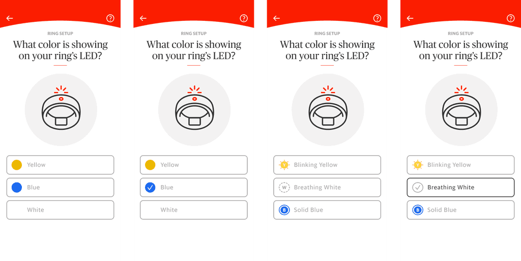
Finding clarity in any lighting
Customers verify they are pairing to the correct ring by confirming its LED color matches what appears on the companion app three times. Through testing I discovered that both color vision deficiencies and varying lighting conditions made it difficult for some users to differentiate between the three colors shown, leading to setup failures. To solve this, while working with the Engineering team on the ring's LED capabilities, I redesigned this part of the setup flow to use a combination of rotating colors and distinct LED patterns to reinforce each option. This shift to thoughtful colors and solid, breathing, and blinking patterns not only improved accessibility and accuracy but also made the entire verification process smoother and more intuitive for all users.


Design Reviews
The Power of Cross-Team Collaboration
Collaboration wasn't just encouraged at Token, it was essential. As a design leader in an engineering focused environment, I prioritized tight sprint planning and team-driven Jira pointing to ensure everyone was on the same page.
As an engineering-heavy company, my goal was to get Product ahead of Engineering as quickly as possible, ensuring that an experience was already well-defined and validated before we started to build it. To make this work, we collaborated closely during sprint planning, pointing Jira tickets together as a team to align on effort, complexity, and dependencies. This approach helped us stay iterative, allowing design refinements to happen alongside development rather than as last-minute fixes.
To say that Token strived to create a culture of collaboration would be an understatement. My monthly one-on-ones with both the VP of Product and the VP of Engineering weren’t just status updates, they were open dialogues where I was expected to bring questions, feedback, and strategic suggestions to improve our workflow, execution, and product experience. I used them to advocate for refining our sprint process, align on long-term vision, and work towards my own professional goals.
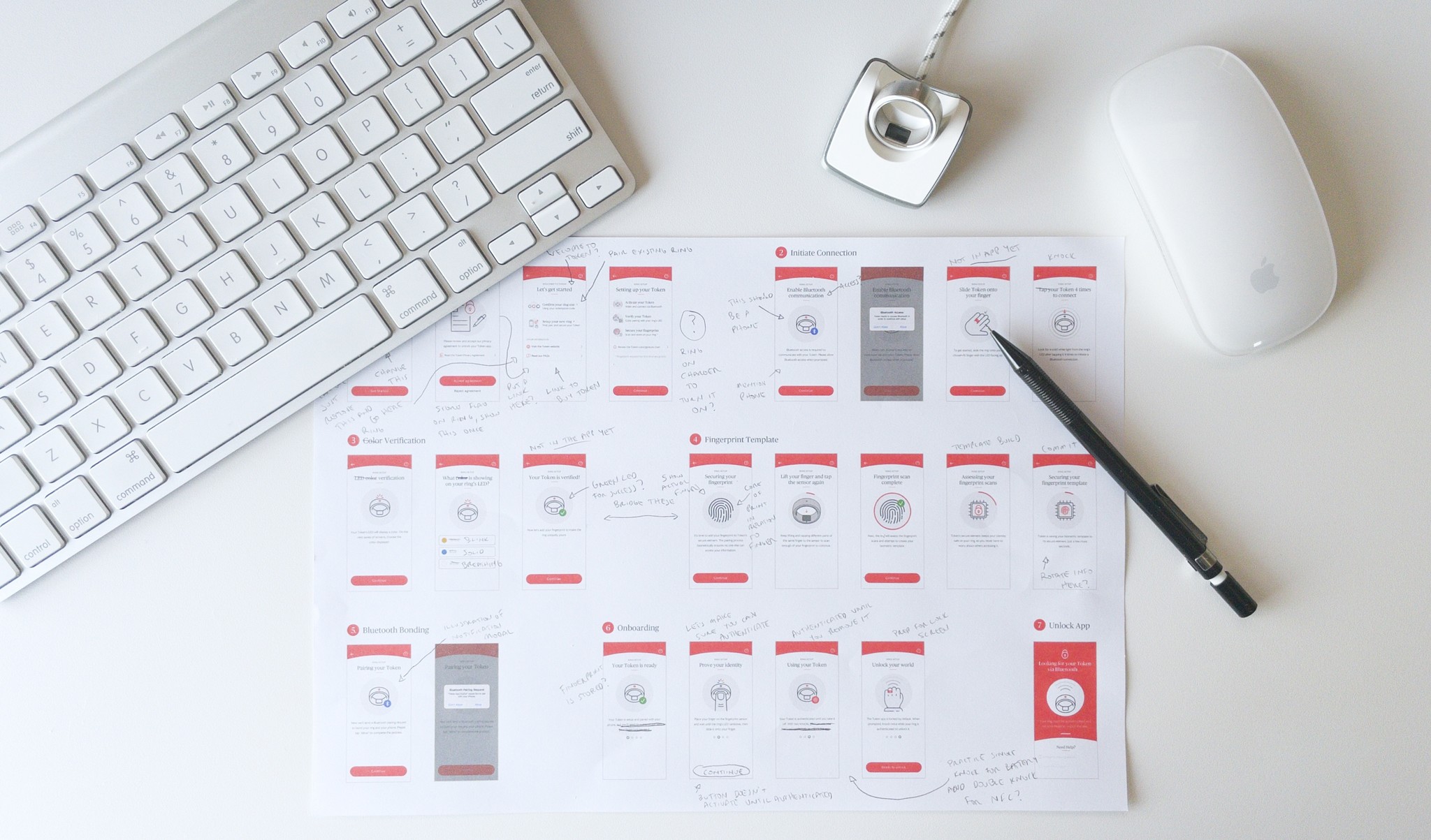
Mapping the ring onboarding flow on paper to make adjustments as we ran tests
Outcome
Going from wild concept to wearable standard
Taking this product from prototype to launch was an ongoing process of iteration, refinement, and real-world validation. From streamlining onboarding to overcoming manufacturing delays and documenting key decisions, every step was an opportunity to refine and improve. We weren't just building a product, we were creating a seamless, secure, and intuitive way for people to access their world.
Through continuous iteration and testing, we cut onboarding errors by over 50%, making the setup process more intuitive and frustration-free. By refining fingerprint enrollment, LED verification, and habit-forming guidance, we ensured that customers could trust Token from their very first interaction with the ring.
Clickable prototype showing the onboarding process
After overcoming manufacturing delays and adding critical UX refinements, we finally shipped our product to our early adopters, which was a major milestone that validated our work. Seeing real users integrate Token into their daily lives provided invaluable insights, allowing us to fine-tune the experience for a broader rollout.
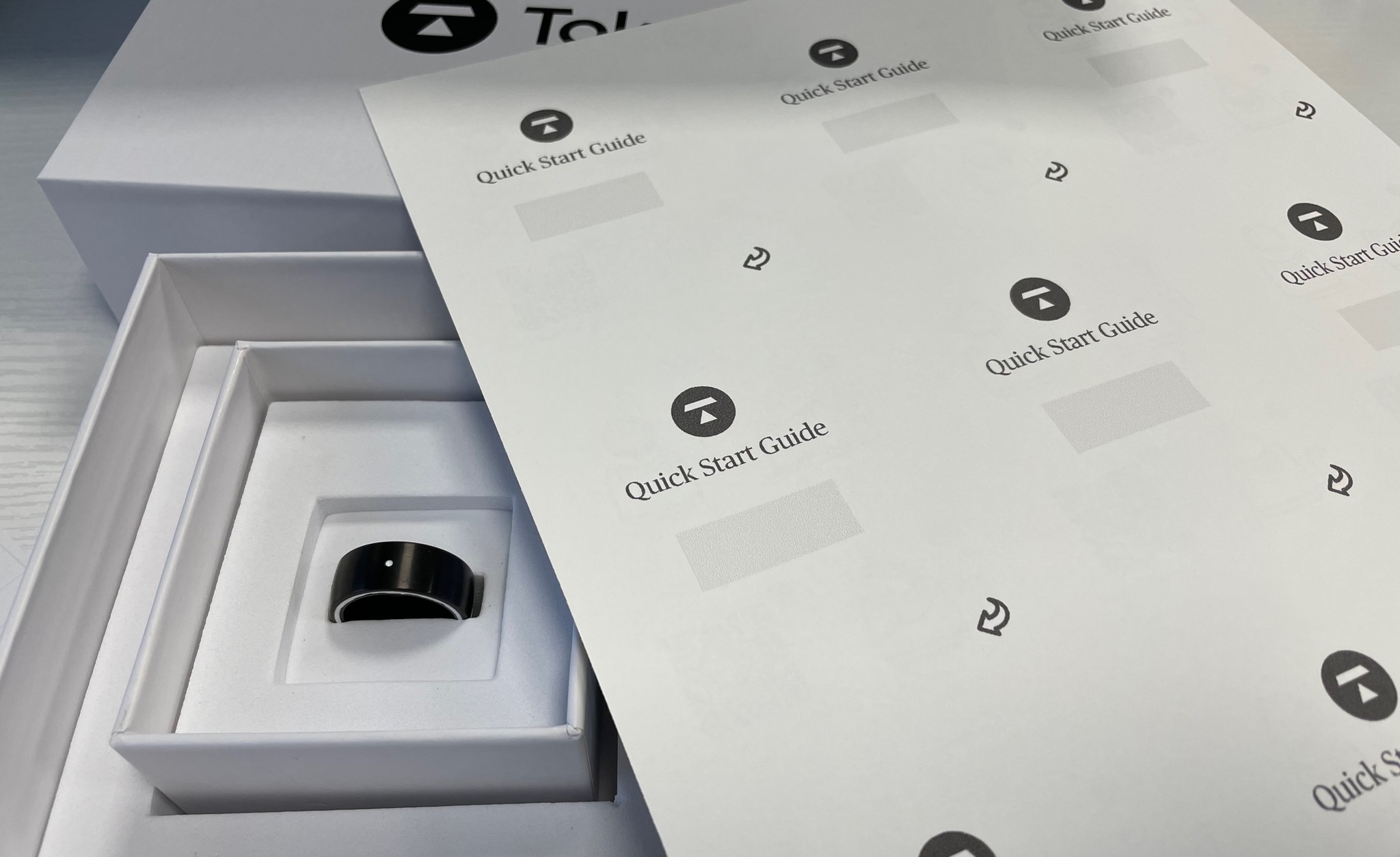
I hand cut Quick Start Guides and packed each early adopter box myself
As Token evolved, keeping track of decisions, functionality, and capabilities became a key part of our process. I worked with the Engineering team to create technical writeups detailing how the ring components worked, the rationale behind design decisions, and best practices for the cross-platform code of the companion app. This not only helped onboard new team members but also ensured consistency and scalability as the product grew.
Retrospective
Transparency and Teamwork Leads to Success
Packing all that technology in a tiny ring was a huge challenge for the Engineering team. Beyond that, the Marketing team had to sell it and the Product team had to make it easy to use. And when manufacturing struggles arose, we reduced the overall impact by working together as a tight-knit team.
Hardware is hard
Unlike software, hardware constraints can't always be patched or iterated upon instantly, requiring careful foresight, testing, and coordination across teams to deliver a cohesive experience. It was up to everyone at Token to test both our physical product and the digital one to ensure we found, and reported, any defects or issues so that both Product and Manufacturing teams could address them as soon as possible.
Good leadership trickles down
A company's culture starts at the top. When leadership values transparency, collaboration, and trust, it trickles down to every team. At Token, having engaged, forward-thinking leaders meant that I always felt empowered to keep pushing things forward, cross-functional teams operated smoothly, and I could advocate for the best possible user experience without unnecessary silos or bottlenecks.
Delight can outweigh friction
Even the best products have learning curves, but delight can make all the difference. Watching customers light up when they tap their Token to pay, unlock a door, or log in to a computer reinforced that a well-crafted experience creates an emotional connection. The ring wasn't just functional, it was magical. And that excitement helped us turn friction into fascination for our customers.
Communication is just as important when things aren't going right
It's easy to talk about progress, but communication matters just as much when things aren't going right. We learned that transparency builds loyalty, even when the news isn't what people want to hear. Being upfront about setbacks, explaining the why, and showing our commitment to getting it right ensured that our early adopters were engaged, not frustrated.
Token securely stores your keys, cards, badges, and passwords on a ring you'll wear all day long
TLDR;
Crafted an intuitive experience for a new product category and delivered for our first batch of early adopters
As lead product designer for Token's security-focused smart ring, I was able to:
Collaborate with Engineering through agile sprints to create a smoother workflow, fewer blockers, and a product that felt more intentional
Transform the unique complexities of an unfamiliar product into an intuitive, trustworthy experience that brought customers delight
Reduce onboarding errors by over 50% through continuous iteration, usability test sessions, and thoughtful design decisions
Adjust the setup flow's LED colors and patterns to account for usability and accessibility issues while streamlining the ring verification process for all users
Organize usability test sessions with both internal staff and early customers to gain valuable insights and real-world validation
Deliver the first 30 rings to early adopters and collect feedback that allowed us to fine-tune the experience for a broader rollout